Wednesday sketchbook page
26 February 2014
So, I find myself home alone on Wednesday evening - home alone (well, not quite! The dog is here!) and all geared up for a bit of sketchbooking.
And why am I so enthused?
Because I have found yet another You Tube source of inspiration! This time a lady called Donna Downey.
She has a series of 'Inspiration Wednesday' - so, it being Wednesday, I was inspired.
I started with this, a blank spread in my sketch book.
So I sprayed it with pale blue ink (using Brusho powder) and darker ink using Procion Dye. I would also have used a sand Brusho ink, but the nozzle was blocked (don't you just hate that!)
The Procion ink was very dark, so I blotted it with paper towel (and got a bit mucky to boot!)
Then I selected two acrylic paints, watered them down a tad and applied them with makeup sponges. I sort of followed the 'corner, corner, side' technique to make a nice blended background.
Then I got some blue heavy body acrylic and mixed that with the pinks, to make an almost purplish blue.
I'm liking this.
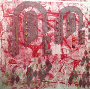
I rummaged around in my collection of handmade print blocks. These are the arches used in last years Horizons quilt.
And then a bit more rummaging through the print block tins, and low, I came upon this gem! A piece of polystyrene cut from a pizza base (I think).
And this is what the page looked like after the two stamp blocks had been pressed into service.
Another stamp block! This one was a real fiddle to make.
And then I found these letter stamps. I think I bought these in Hobbycraft. They were pristine and new.
I used an ink stamp to load up the letters and print on the page.
And finally, I added some gold ink. (it had gone a bit congealed, but still worked).
Jewel like colours!
The finished page.
And here is the super sophisticated Procion Dye spray ink bottle. (obviously I washed it out thoroughly first!)
And then, because there was a good play on the radio, which hadn't finished, I gessoed some old Christmas cards. I am thinking small handmake book with these.
Definitely a very productive Wednesday.
Tomorrow I have to decide how much of the studio to pack and take South to Portsmouth for a long weekend. Difficult, I always want to take it all!
A positive note
24 February 2014
Sunday was a day full of accomplishments.
The dog had a good walk ( serious browny points earned there by me! The dog keeps a tally, you know. He is a hard task master!)
I had a bit of a tidy up in the studio, which meant I could put up the sewing machine!!
I stitched all four of the pepper mixed media pieces. They are now ready for framing.
I listened to all four episodes of Brideshead Revisted back to back on Radio 4 Extra ( I just love the listen again facility when I can just listen to a whole block of programs). I had forgotten how melancholy the story is.
And I did a sketchbook page which was pretty successful.
So, in case you're interested, that is the background page done with the corner,corner, side technique from the last post, with additional texture added by spraying ink though some net packaging. The ink was too much and the background is lost, but that is the point of sketchbooks, to record and play - not necessarily to get it right.
Then a bit of sketching and inktense pencilling.
Then the piece at the left hand is a strip of coloured paper, with a bit of wax resist, stitched with the same leaf pattern.
And I spoke to Christine Seager about helping out with the CQ Gallery at FOQ - but more of that in another post.
Getting back on terra firma
23 February 2014
After a hectic day yesterday when I went and signed up with half a dozen local estate agents and picked up my mixed media pieces from The Tree and Me exhibition, I had a bit of a play in the studio - nothing too taxing or creative, just a fiddle about.
Now you might know that I have been You Tube hopping and found the Paperartsy channel. I have shared a few of the videos with you.
Well one video is on decorating backgrounds. Leandra, the resident artist I am thinking, is a whiz with the acrylic paints. So, I decided to give her technique of 'Corner, Corner, Side' a go.
I assembled my weapons.
These are three acrylics from Hobby Craft. I think they are an American brand. They have been OK but now I have discovered the Fresco Finish paints I will get replacements from there. The white is a system3 Acrylic from Daler Rowner. That's an oil stick in the foreground ( I find them the best for applying subtle colour through a stencil) and a commercial plastic stencil. I think the only one I have.
They're not in the picture, but I used two make up sponges to apply the paint.
So, here is a card background.
Less successful as the colours don't blend so well.
But here is a page from the sketchbook
I am really sorry but the light is poor - the colours are very pale taupe and pale green. This background is much more blended.
You can see the stencil, but can you also make out the squiggly lines as a bit of background? A bit like a post stamp?
Well, who needs an expensive stamp when you have this!
Feeling a bit all at sea (no reference to Southsea)
22 February 2014
I have had some slightly unsettling news.
The landlords of my 'home from home', who live in the USA have apparently decided to sell up. In all honesty it is no real surprise. We have been here over five years and they have not really looked after the place. Last year, when we had ongoing roof leaking problems, the landlords brother, who happens to be a roofer, told me that he thought the house was 'running away with them'. Old houses need tlc and this one hasn't had much.
So I had an email from the letting agents yesterday telling me this.
Now subconsciously I think I have been expecting this. I have been very unsettled - you can probably tell from my random blog posts of late. Not much art, just a lot of you tube browsing. There is more change at work - some of that in a good way and some perhaps a bit less positive - and I think as I get older I am becoming more unsettled by change.
But hey ho - I must press on and get a grip.
Now there are two things that might happen from this. The first, and less appealing as I hate the driving, is that I will have to go back to my south coast base and work from there, but trek up and down the A34 (a nasty road for any foreign readers) to get to the office. This is seriously going to sap my creative energies and creative time, diminish my quality of life somewhat and generally make things a bit grimmer.
The second, and the company I work for has to agree to this, is that we find somewhere else. Then my challenge will be to find a rental property that is dog friendly, affordable, suitable for surveyor training and has space to relocate my studio. A challenge, but, on balance, a preferred option.
So I think that today I will make a start to look around for somewhere else to stay up here and hope that the company agrees.
Meanwhile, work does go on.
The peppers just need a bit of stitch and then they are finished. The recipient has seen photos of the work in progress and said that she liked them, so that is good. I bought frames in the week so plan to get those out of the door this weekend if I can.
Secondly, I have volunteered to help with the CQ gallery this year at the Festival of Quilts. I have to phone Christine today to see what is involved.
Thirdly, I need to crack on with my own FOQ quilt - and possibly- quilts.
So, no more feeling sorry for myself and onwards and upwards.
And just to prove I have not been completely idle, here is a sketch book page plus some birthday cards I did this week.
Southsea after the storms
20 February 2014
Now the poor old UK has been battered by winter storms. The West Country and Wales has taken the brunt, but other places have also been battered.
Brighton lost its pier. Portsmouth, though further to the west than Brighton, fared much better, I think because it was protected by the Isle of Wight.
That said, this should be the promenade - not the beach!
But the storms dragged up some lovely rubbish ( why is it that on a beach, rubbish takes on a much more romantic aura - perhaps it's the implication of travel, shipwreck and journeys).
And I love the colour of this rope against the shingle.
Meanwhile, the dogs had a whale of a time.
Paperartsy Part 2 (golly this is getting silly)
Here is another one - that is another Paperartsy video.
I am not a fan of commercial stamps at all, but there are some very useful painting tips in this video.
I really like the standard of the videos from this company, and the painting tips are really useful.
This is more of a scrap booking channel I guess, but you have to be open minded and while I might not be a fan of commercial stamps, you have to admire the paint technique used.
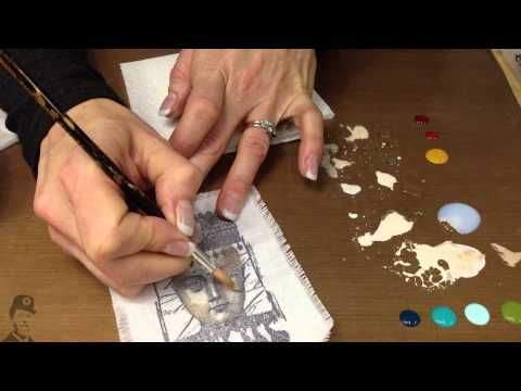
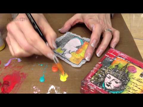
Fresco Finish Chalk Acrylics by PaperArtsy - Information Video
19 February 2014
In my last post I confessed to being just a little bit smitten with the look of a range of acrylic paints I found while mooching around the web.
And here is a just fabulous film that introduces all the colours. Other manufacturers take note - this really makes me want to grab the plastic and hit the online store.
ps. I hope you can see this. For reasons that I don't understand, on my iPad I cannot actually see the videos embedded here. On the laptop I can. Anyone able to explain that?
Paperartsy - a mixed media diversion
18 February 2014
When time is tight, fatigue sets in and art seems to be pushed to second best, there is always the internet to keep me happy. And, while wandering the web, I think I might have become just be a little bit smitten by a range of paints I have just discovered ( but I don't have any yet) and the accompanying You Tube channel.
So, for your delectation:-
So, for your delectation:-
Settle down with a cup or glass of something delicious and enjoy. The technique is interesting and those paints look really good.
Revisiting the Horizon Quilts
9 February 2014
You may remember that last year I entered my first ever quilt at FOQ as part of the Contemporary Quilts gallery. I had a few technical,issues!
One of my technical issues was my own rather dire photography.
And here are some interviews with some of the quilters from Bonnie McCaffery.
Already thinking about this years quilt - the theme is 'dislocation'.
But peppers to finish first!
Ps. sorry - you have to cut and paste the links. I'm writing this using the ' Blog' ap on the iPad and cannot work out how to embed a link.
Pps. No you don't! Fixed the links I hope.
Pps. No you don't! Fixed the links I hope.
Thinking about future work ...
... and revisiting the past.
One of the very first forays into print I did yonks ago (it must be something like 5 years) and I did not really know quite what I was doing, but was in a very 'what if' frame of mind.
I started with a very simple print plate that I made sticking vaguely leaf shaped card pieces onto a card base (looking back on it this was probably a very simple collograph plate, but at the time that was not a term I recognised). It is significant that I used the shiny surface of some packaging.
I printed using very 'wet' Windsor and Newton inks like these - painting them onto the card surface. The shiny surface just 'held' the ink rather than it soaking in. A lucky accident because I was very green in those early days.
I printed onto A5 sized rag paper, but I had very roughly 'sketched' leaf shapes onto this paper with a wax candle before printing - this obviously created a resist and the white areas on the paper.
Here are a couple of those print runs.
Then I scanned them onto the ancient old laptop, and framed the originals (they hang on the landing in my 'home from home').
Now they have popped up in some work already finished. You can see them here,a finished mixed media embroidery in the Gallery section of this blog. (tissue hand coloured with a print block and with sweetie foils, then stitched with the prints collaged on. There is beading in there too!)
Having scanned the prints I did a bit of manipulation and then printed them onto the printer ready fabric pieces you can buy from Crafty Computer Paper here in the UK (sorry to my foreign readers - I don't think these people ship abroad, but I am sure you can find similar suppliers in the USA or Australia). I know you can also make your own fabric printer ready - there is something you can buy from Art Van Go and you can iron it onto freezer paper to make the cotton feed through the printer, but to be honest, this isn't something I have tried. Other blogs may help you with that. Anyway, it was these fabrics that I collaged onto the piece. This example, plus a couple of others are now a good couple of years old, though they have not really had a public outing.
Any how, thinking about this years Festival of Quilts (months away but my time is precious and I have to plan ahead!) I have an idea hatching in my mind.
Hence this weekend I revisited those original scans and had another little play with them in 'Print.net' - manipulating the colours to give me these alternatives.
You can probably tell. this last one is the odd one out - the first 4 are all variations of one original print.
A bit more manipulation is probably needed but I think a plan is being hatched and a design is forming in my mind.
Pepper post - the end is in sight
5 February 2014
Despite a few little diversions and excursions, I am still progressing with the little peppers project.
Why peppers? Well a friend who has a delicatessen said she might be interested to have a few little pieces in her shop to decorate a few blank areas of wall. And if she doesn't like them then I want to try the little Tea Room nearby that also sells art. It's time to get my work out there a bit more.
I love this mark making technique - monoprinting on tissue paper which I stick down and hand colour with inks. And then additional collage from inked book pages.
Here I have used pen to add additional embellishment but for the final pieces the last marks will be stitched.
And here are two pieces in progress - here the tissue is stuck onto rag paper.
Only in London .....
3 February 2014
Subscribe to:
Comments (Atom)


