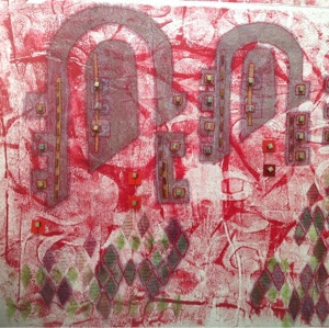
This is a bit of a pattern heavy post. Get your sunglasses out!
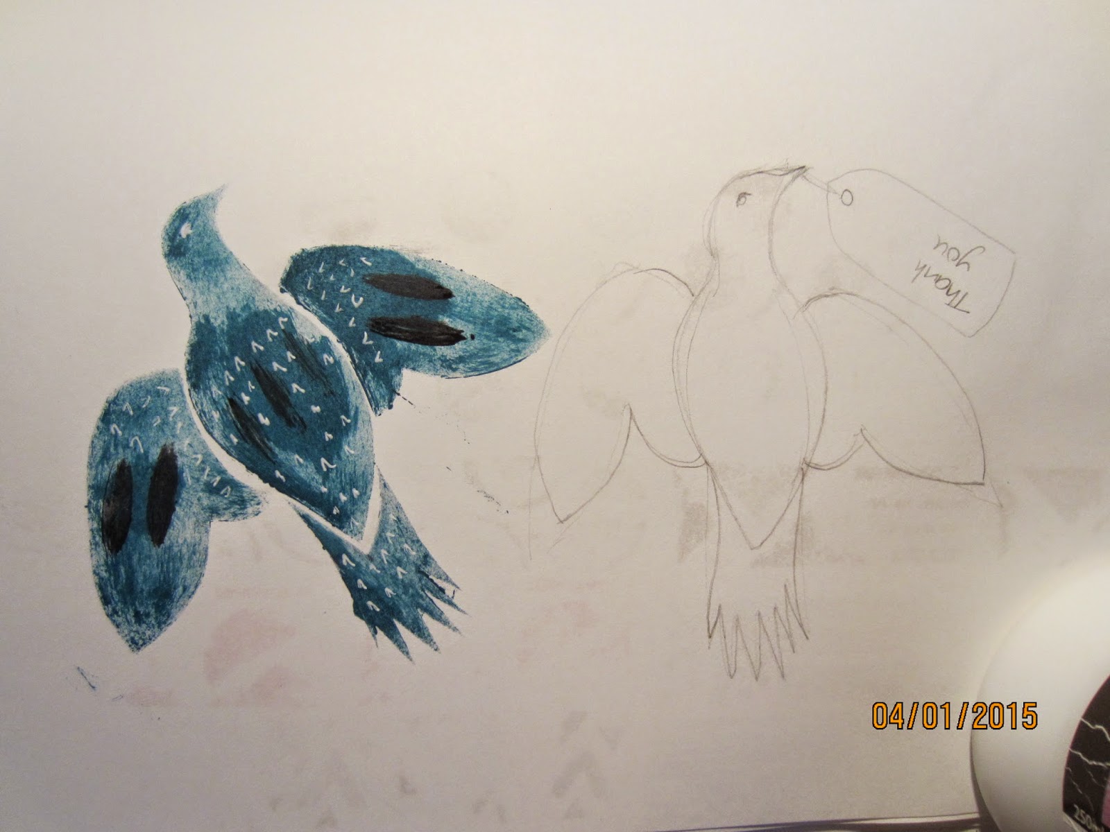
But to break you in gently, here's a bird!
If you are familiar with the work of Mark Hearld, you will recognise the style. I got out the RSPB book of bird identification which shows birds in flight, turned to the pigeons and doves and did a little sketch (on the right hand side) but the proper tail did not give enough impact so there is a bit of artistic licence with the tail! (in truth this bird probably wouldn't be able to fly!)
And then I got out my favourite paints. Now I am not sure if you can tell, but all of the paints I chose are opaque rather than matt colours (with the exception of the black in front).
By mixing them with a bit of matt medium I made them even more opaque.
And if you remember in the last post I made some little stamps, and here they are in use.
The only consistent thing I did was to print the blue first and always used the triangle stamp for the orange.
Otherwise, these are all different.
Very mid century.
So, back to the bird.
I cut a little stencil (the body, tail and wings ae all separate), stencilled this onto white paper, added a bit of decoration with black paint and a white highlighter pen, and then cut and paste the birds onto the patterns (I am making cards - I forgot to mention that!)
The birds are a bit lost against all that pattern, so I need to make them pop a bit more.
To be continued.


Enjoying this so far, and looking forward to the next instalment
ReplyDelete