
And a bit of collage ( additional papers and fabric)

The two light houses are still waiting for stitch.
But these tea cups have been on the machine. (Coloured papers collaged on plus a bit of watercolour paint).


As has this leaf motif (papers and paint have been applied to, ad you might just be able to make out the shimmer of the organza layered over the rag paper). I think a few beads are needed too.

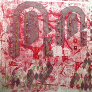
And this one also needs a bit of oomph. The colours are cool but it needs a bit of a lift.

You may recall, dear reader, that this is all supposed to be blue and white!
Well I just couldn't work to just blue and white - hence a few accent colours creeping in. Do you think anyone will notice?


Lovely, great accent colors, notice? Noooo! I must 'do' the lighthouse down the road from here, been 5 years since the last one!!
ReplyDeleteI'm a bit smitten with lighthouses just now. No reason except Jonny Hannah uses them a lot. We certainly don't have one in MK!
DeleteNothing like a bit of red or orange to liven up blue and white ... especially in the case of orange, something about complementary colours ... never to be ignored!
ReplyDeleteGlad you think so! Luckily my comrades do too! Phew - they're happy that I have strayed away a bit from a true blue theme.
Delete