Introducing Dorothy
29 August 2018
Let me introduce you to an elegant lady of uncertain years.
This is Dorothy - and she is a caravan. But not an ordinary caravan (the picture below might give it away slightly, since most ordinary caravans have the tow bar at the front).
Dorothy is not quite what she seems because she is a folding caravan. All those sides collapse (you can see the 'seams' in the photo below). She is a Rapido - a french folding caravan. I think she is about 40 years old - may be a little older.
When she folds down she looks a bit like a trailer tent - all neat and compact and you would never know.
But when she is up she is a little gem of retro heaven.
She belongs to my lovely friends Rob and Andy and when they got her she was a bit past her prime. Like all ladies she needed a bit of a spa treatment.
So they recovered her seats and painted her walls (originally she would have been cream inside).
She has a neat little folding kitchen.
And she sleeps 4 people.
The table drops down to make a double bed.
The single at the other end can also be pulled out to create a wider bed. It is all quite intimate so I think it would be best if everyone knew each other pretty well.
She goes on jolly japes and adventures with Rob and Andy. And sometimes she doubles up as a spare guest room nestling against the plants in the front garden.
Such an elegant lady. And apparently, unlike ordinary caravans, very easy to tow.
A peak inside my process - lampshades from old maps
16 August 2018
I am sure that I have promised to share a process with you - how I make lampshades from old maps.
This started about 3-4 years ago. A happy accident if you will.
After my father died I was staying with my Mum, and we had a little session clearing out some of his stuff from the loft. One box contained old maps. Not historic, vintage maps. Just old maps that had been bought for holidays or we just had knocking around for a while.
Mum asked if I would get rid of them - perhaps I could take them to a charity shop.
So I put this box in the car and brought it home.
But I did not take it to the charity shop immediately. I brought it in from the car and plonked it down in the studio.
Now, at the time we were planning Transformation - the exhibition in Milton Keynes that we ran in October 2016. In the run up to the exhibition the concept of landscapes changing over time had been playing on my mind.
I looked at the maps in the box and realised that they would not be of much use to a charity shop. They were out of date. I cannot remember which one now, but one was of an area I knew quite well and there was a road missing - clearly a road had been built after the map was published. Not a lot of use as a map then!
And then I realised that the paper was just fantastic - it would be robust enough to take wet media and a bit of stitch. And I began to use maps as a background for a new body of work.
Now I love doing work for display on walls, but you run out of wall space and one day the idea of using the maps in a three dimensional way dawned on me - lampshades!
I have written about this before. You can see a previous blog post about making lampshades here.
But let's return to these. I promised I would share this process - and the key element is the background decoration.
Start with a map, a stencil and a wax crayon. The wax crayon will give you resist for the inks you will use later.
I just use a basic Crayola wax crayon - nothing special. The stencils I use for this are just commercial stencils. Again nothing special.
Vigorously use the crayon and the stencil to create a pattern. Put the stencil under the map and rub.
The picture below shows the sort of effect you get. You can make out the stencil pattern in the bottom right hand side of the map.
At this point I should tell you that the map above is not I used for these blue lampshades. In fact, for these lampshades, I used a white wax crayon and a different stencil. But you get the idea. (you can't see the wax with the white).
Then I use ink - in this case I was going for a vivid blue so I used Brusho inks.
Sprinkle the ink on and then spritz with water.
You want to be generous with the ink powder but not so much that you completely obliterate the map.
Here is the effect you are after and you can see the stencilling beneath.
You need to fix the ink. I use a spray fixative, in this case something I had bought from Hobbycraft.
I also had help! I was doing this in the garden on a lovely hot summers day.
Back to the map.
I chose the size of panel I wanted from my stock. This was not a particularly big map but large enough for two panels to turn into oval lampshades.
Then I selected embellishments. I have a number of different 'styles' of map lampshades - some are very heavily stitched but these I wanted to keep relatively simple.
I chose images from an old copy of 'Diary of an Edwardian Woman'. I have about 3 copies of this - I collect them from charity shops, snatching them up when I see them. The images are perfect for this sort of work and I really like the paper this book was printed on - it has a real 'watercolour paper' feel to it.
For these lampshades I selected bird related images, though with a couple of plants to add a bit of balance and interest.
I stick the paper onto the map, thinking about the construction of the final lampshade, and then stitch, in this case with a contrasting red thread. One thing to add is that I do iron the maps to press out creases and crumples. You want the paper as flat as possible when you construct the lampshade.
And finally, I assemble the lampshade.
As I mentioned above, I have done a similar tutorial on making lampshades before - and that included a video of how to actually assemble the shade. Pop over to this blog post to see the video and a slightly different take on map lampshades.
Finally, why not have a go yourself.
Thanks for reading.
Gothenburg
13 August 2018
Another instalment from the Swedish Tourist Board!
Seriously, I was really taken with the place from the few days we were there. (You can read about my Malmo experience here).
From Malmo we took the train up the coast to Gothenburg. We only went for a day so it was just a flying visit, but nevertheless we got a lovely vibe and it would be a good place to return to.
This piece of street art appealed - I love dogs and this captures their spirit entirely.
We were mooching around in search of sustenance when we came across this amazing building - Feskekörka.
A bit of history - this was originally the harbour side fish auction house and was architect designed with very distinctive arch windows (it looks a bit like a church) and internally an open structure without partitions and columns.
Over time, the fish auction moved and the building has become a fish mongers and houses two fish restaurants.
The fish counters are arranged down the sides of the open gallery space.
And various monsters from the deep were available to purchase.
We opted to have lunch in one of the two fish restaurants in the galleries at each end of the market. We went to Restaurang Gabriel.
One of the best meals I have ever had - simple and full of flavour.
The other highlight was the staff - the waiters glided around as if they were choreographed! Effortlessly food appeared. I found them fascinating. They also had the most fabulous aprons but I felt too embarrassed to take a photograph - so you will just have to take my word for it.
Outside Feskekörka was this charming statue. That dog! This perfectly captures the focus of a dog waiting for a scrap, a juicy morsel. It could have been my old boy Gazza who loved fish! (In fact, just looking at it now, I cannot get over how like Gaz this is. It is almost as if he modelled for the artist!)
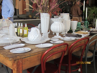
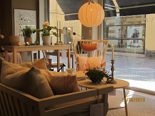
The other highlight of Gothenburg (and indeed the whole holiday) was the achingly cool scandi interiors. We found this shop and took photos and dreamed of taking that tan sofa in the second photograph home.
A lovely day trip and a charming city.
Colour matching
3 August 2018
Do you ever look at a photograph and feel completely inspired by the colours?
And then do you walk down the paint aisles at major DIY retailers and either feel completely overwhelmed or disillusioned?
Yes - me too.
But a little while ago, I think it was on Julie Fei Fan Balzer's blog, I discovered that there are apps out there that help you analyse the colours in photographs.
So I had a little play.
First of all, I used https://palettegenerator.com/
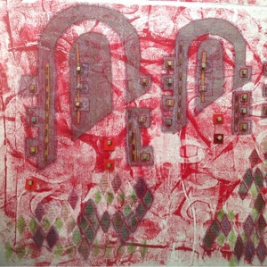
This first one was generated from an acrylic painting.
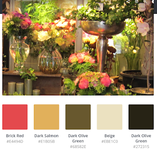
That feels about right, but I was surprised by the next one, generated from a photo I took in a flower shop in Malmo.
I thought there would be more pink and green - these are the colours that I 'see' when I look at the source photograph.
So I homed in on a smaller, brighter section of the photograph and tried a different palette generator. This one is https://www.canva.com/color-palette/
I did this twice, using two slightly different areas of the source photograph.
Again there is 'brick red' where I only see pink but I feel more trusting of the second site. The colours 'feel' better.
But I am still not getting pink. And to me, there is a pop of very definite pink in the photograph.
Have you ever used one of these websites and if you have, do you have a favourite? And I would be intrigued to know if anyone has taken a colour analysis like this to the next stage.
Thanks for stopping by and do let me know if you have experience of these colour analysis sites.
Subscribe to:
Comments (Atom)


