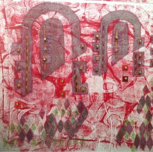
The Handmade Journal (Get a brew - this is a mega post!)
12 March 2014
I did it! It is done, complete and in the post - winging its way to it's new owner.
Here is the beaded spine - a mix of hand made and bought beads.

And a bit of a flip through of the pages.


The back of that 'Rules' tag says None, by the way!


Oh - and this is the inside back cover with a few artist materials ready to go (I also added a few gel pens too)

Will she like it? I don't know!
Will she even 'get it' - I don't know that either. Daughter No 1 says "Its a journal - of course she'll get it!"
Well, I promised you a tutorial of sorts, so get a cuppa on the go and settle down, for here is how I did it!
First up a good bit of strong recycled cardboard - an old Boneo box was perfect!

I cut off the various flaps but stuck them to the inside to give it more strengh (using double sided tape and PVA)
The spine is a cracker packet - all four sides are used (2 x 2 for strength and laid side by side - again stuck to the Boneo box with PVA and double sided tape. I did a bit of measuring here to get it even)


Next, brown paper to give a more even surface and hid the bumps. PVAd onto the box.


OK - so now it's looking promising.
Next up - a bit of calico, backed onto Bondaweb, cut into squares and then stuck down.
I confess, I got the idea for this from Lin Brown's rather fab blog here. (Tell her I sent you over for a peek when you pop by!)


Promising, but still more to do.
At this point I gave the whole thing a coat of white acrylic paint. I used a heavy body acrylic from Daler Rowney, simply because I had it and it has excellent opacity. I knew that if I did not tie the background together in some way it would be hard work later. I am glad I did. I could have used Gesso, but I did not want that sandy, texture finish.
So now my new toys are going to be pressed into service. (If you are interested, contact info is at the bottom of this post)

And just look at the mess I had created along the way!

But first, I needed to make a stencil. More recycling - this time with an old acetate folder cover. Easy to cut though a bit flimsy if I am honest. Still it did the job.

Test page in my sketch book.

And now for the cover! With a palette knife I applied a bit of the Grunge Paste from PaperArtsy. (you can see how the white paint just knocked everything together here. You can also see how far from a Boneo box this is now travelling!)

And now to paint!
I was very smitten with the colours that Lin had used in her piece so I treated myself to some really with this project in mind. I am always drawn to warm, earthy colours.
I used Chartreuse and Tikka blended together and tied down with Chutney around the edges.
Then I used some 'Treasure Gold' - this is not really a paint, but gold pigment suspended in a very smelly fluid a bit like white spirit. You don't need much at all. Just a few gentle strokes to bring out the texture of the raised leaves.
Next some old chocolate wrappers for added interest.


Then I turned my attention to the inside of the covers.
Since this thing was to have a pocket at the back the inside had to have a bit of oomph - step forward the pelmet vilene.
Painted in the same was as the front.


Now here you have to start planning your pockets.
For the back I used some previously marbled fabric and made a double layer pocket, as you can see here. The peg is helping the PVA make a good firm bond.
i also had to think about the closure at this point. I decided on elastic. If I am honest, this is the one bit of the project I would change in future.
As you can see from the picture I had three separate pieces for the inside covers - front , back and middle. That was definitely a wise move with the movement on opening and closing.
The red thread is the button on the front to hold the elastic (in face 2 buttons and a bead in a little stack). Again, in future I think I would change this and make a home made button that tied in better to the design.
I did make, but then rejected this beauty. For another project I think.


And the inside finished - the little pockets on the inside front cover are marbled and stamped tyvek from my stash.

The book at this stage. A full days work and now just the folios to go.


The cards have enough strength to give the individual folios structure to hold together in a loose binding. The other pages were made with rag paper (tear it to give it lovely soft edges if you ever use it) and some other random art papers I had. Some I painted and even printed, but some I left white.
So they were painted and stamped and in some cases embellished with painted tags or more previously decorated fabrics.


So another hand made stamp. (I love making hand made stamps!)


So now just assembly.
But first, let's audition some beads (I love that word!)
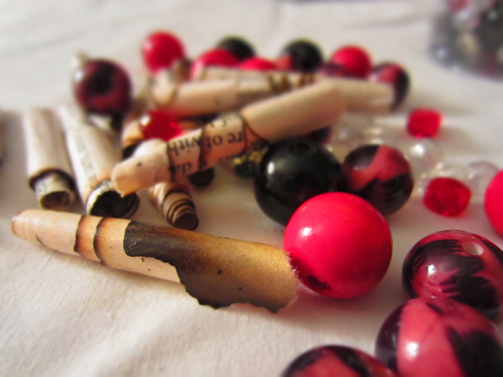
A mix of handmade (from a torn book with burnt edges - lovely effect but a tad risky! These were the result of another day playing at just making stuff following inspiration from this blog and video channel)

So here is a flip through of the finished article.
A couple of decorated tags at the beginning to make it personal.


A few tags in pockets are hidden in the book. For no particular reason.

The spine!


Tag with a tea pot - Fee loves Tea Pots!


Loving my crab stamp. He'll be used again for sure.


And there you have it.
I am really please with the outcome of this book, and I love the effect of the new paints and the Grunge Paste.
This was a very hefty project - hence the blogging silence (blog or create? Well - duh - create!!)
I now need to go and recover - oh and plan the next project.
Seriously, let me know what you think. I really loved making this and already have another in mind.


Still here - in every sense!
7 March 2014
I notice that it has been a week since my last post.
But don't worry - I'm still here!! In every sense!
If you read my blog regularly you'll know that the wind was taken out of my sails a bit by the fact that the owners of my 'home from home' have decided to sell. I'm coming to terms with that and have started to look for somewhere else. That's a bit bleurgh if I'm honest - too small, wrong location, no pets - but so much keeps pinging in my direction from Rightmove that I am fairly certain that something will crop up soon that just screams out to me.
That is if I decide to keep up this duel life. I could just up sticks and go home ( lots of crap at work that makes me feel that I could just do that) but I just don't then want to spend what would otherwise be creative time hammering up and down the A34.
Anyhoo, you don't want to read about all of that guff.
What are you up to creatively, I hear you cry!!
Well, a new, rather ambitious ( for me) project. A present for a very dear friend who is 60 next week - so I've got to get a wriggle on! Plus the pepper pics still need to be popped into their frames!
So, a busy weekend!!
Bear with - I'll be back shortly with pics, and possibly a tutorial of sorts ( if I get my act into gear) on how I get on with that project. I'm very excited about it! Daft really, but I am.
Oh, and I ordered some of those paints I have been banging on about.
Pop back soon for the big reveal!

Wednesday sketchbook page
26 February 2014
So, I find myself home alone on Wednesday evening - home alone (well, not quite! The dog is here!) and all geared up for a bit of sketchbooking.
And why am I so enthused?
Because I have found yet another You Tube source of inspiration! This time a lady called Donna Downey.
She has a series of 'Inspiration Wednesday' - so, it being Wednesday, I was inspired.
I started with this, a blank spread in my sketch book.
So I sprayed it with pale blue ink (using Brusho powder) and darker ink using Procion Dye. I would also have used a sand Brusho ink, but the nozzle was blocked (don't you just hate that!)

The Procion ink was very dark, so I blotted it with paper towel (and got a bit mucky to boot!)
Then I selected two acrylic paints, watered them down a tad and applied them with makeup sponges. I sort of followed the 'corner, corner, side' technique to make a nice blended background.


Then I got some blue heavy body acrylic and mixed that with the pinks, to make an almost purplish blue.
I'm liking this.


And then a bit more rummaging through the print block tins, and low, I came upon this gem! A piece of polystyrene cut from a pizza base (I think).

And this is what the page looked like after the two stamp blocks had been pressed into service.

Another stamp block! This one was a real fiddle to make.


And then I found these letter stamps. I think I bought these in Hobbycraft. They were pristine and new.

I used an ink stamp to load up the letters and print on the page.

And finally, I added some gold ink. (it had gone a bit congealed, but still worked).

Jewel like colours!

The finished page.


And here is the super sophisticated Procion Dye spray ink bottle. (obviously I washed it out thoroughly first!)

And then, because there was a good play on the radio, which hadn't finished, I gessoed some old Christmas cards. I am thinking small handmake book with these.


Definitely a very productive Wednesday.
Tomorrow I have to decide how much of the studio to pack and take South to Portsmouth for a long weekend. Difficult, I always want to take it all!

A positive note
24 February 2014
Sunday was a day full of accomplishments.
The dog had a good walk ( serious browny points earned there by me! The dog keeps a tally, you know. He is a hard task master!)
I had a bit of a tidy up in the studio, which meant I could put up the sewing machine!!
I stitched all four of the pepper mixed media pieces. They are now ready for framing.
I listened to all four episodes of Brideshead Revisted back to back on Radio 4 Extra ( I just love the listen again facility when I can just listen to a whole block of programs). I had forgotten how melancholy the story is.
And I did a sketchbook page which was pretty successful.
So, in case you're interested, that is the background page done with the corner,corner, side technique from the last post, with additional texture added by spraying ink though some net packaging. The ink was too much and the background is lost, but that is the point of sketchbooks, to record and play - not necessarily to get it right.
Then a bit of sketching and inktense pencilling.
Then the piece at the left hand is a strip of coloured paper, with a bit of wax resist, stitched with the same leaf pattern.
And I spoke to Christine Seager about helping out with the CQ Gallery at FOQ - but more of that in another post.
Subscribe to:
Posts (Atom)