Paperartsy

Valentines Cards (a little bit late!)
25 February 2018
I had a session making Valentines cards. Now I know it's a bit late for Valentines, but bear with me because the technique would work with other motifs (in fact, as well as using a heart motif, I also used a leaf motif - so point proven!)

It's a simple technique - borrowed in part from Julie Fei Fan Balzer. Now, I am sure I have mentioned Julie before. In fact she does not need me to sing her praises. She is a one woman artistic power house!
But she posted a lovely little blog here. Go and have a look.
And I borrowed the idea of masking and printing, but I started with pages I had already inked up. (I always have a stash of papers to pull out when needed). In this case, dictionary pages coloured with a combination of Infusion Inks and Fresco chalk paints.

I cut a couple of stencils from paper. One was a heart, and one was a stylised leaf - you see, I told you it wasn't just about valentines.
I selected a range of papers and trimmed them to fit the card blanks I was using.
For this to work, you do need a fairly simple shape and one that is "connected". Remember, you want to use the shape you have cut our as a mask later in the process.

Despite having a tin full of home made 'stamps' and print blocks, I still felt I needed another one for this project - hence this mess.

In this case I used self adhesive foam sheets from Hobby Craft. In the photograph below the bottom block is the new one I made specifically for this project. The top one is a block made ages ago. I am sure I must have shared it before. I stick the foam onto stiff card - packaging from dog food is ideal I find. Cereal packets etc. are too flimsy while Boneo biscuit packets have enough oomph to take the paint and the cleaning afterwards!
I sometimes work with a craft knife when I use sheet foam to make blocks like this. Alternatively I snip the foam sheet with scissors.

Now, at this point my photography went awol. (I really do need to learn how to set up a little video camera for this sort of thing!)
There were two stages.
First - using the whole sheet of paper as a stencil, I added markel paint stick with a stiff stencil brush.
Second - using the shape cut from the same paper as a mask, I printed over using Fresco Paints and the block I had made.
(Pop over to Julie's blog to see how she does it.)
These were the colours I used (most of the papers were fairly dark and I wanted the pattern to be lighter than the background.)

This gave me a range of papers looking something like this (you can see the shimmer from the paint sticks).


Now, because this was, for the most part, dictionary pages I needed to add a bit of substance if I was to add stitch. So I mounted these papers onto a backing of stiffer paper (an assortment of khardi and other craft papers, also from my supply. I used Hi Tack glue - I find this doesn't make the paper wrinkle.)
And then I got the trusty sewing machine out - newly serviced and cleaned - and stitched the leaf and heart shapes.


And - voila!

Sunday studio day
18 October 2016
What with one thing and another, it has been a while since I have had a proper studio day.
So, Sunday was very welcome.
First of all, I had to unwrap presents to myself - some Infusion inks


Both from Paper Artsy.
Now I love their paints. I really do, and just to make this little package extra special look - they are a limited edition set put together by Seth Apter.

But you know what? Time in the studio is so very precious (as Kit Lang so rightly pointed out here), if someone else can mix the paints for me then why should I feel too guilty.
And look, when the paints land, they arrive with nifty little cards to tempt you even more.


What's not to love.
But lets get back to those inks!
Now, dear reader, if you follow this you will know that I am a bit of a fan of Brusho Inks. They creep into my work quite a lot.
Hence, I was keen to try some new inks that work on the same principle. They are dry powder and are activated when they get wet.

Sprinkle on paper, spritz with water and pure magic.


The difference with these inks and Brusho inks is walnut pigment (I think - anyhow it's a brownish pigment) so the effect is more 'vintage'. You can see this clearly in the pictures above as the ink colours capture the water.
But I still went a bit mad on a bit of khadi paper - see below, captured while wet. The colours are so vibrant when wet.


Then I experimented by sprinkling the powder onto the paint while the paint was still wet - with a bit of a spritz to help it along. (using an old dictionary page in this instance)


But then I just coloured some pages up to add to my stock - simply applying the colour with an old credit card. These are using paints from the new set.


Here I just grabbed my paint trolley and went for it.
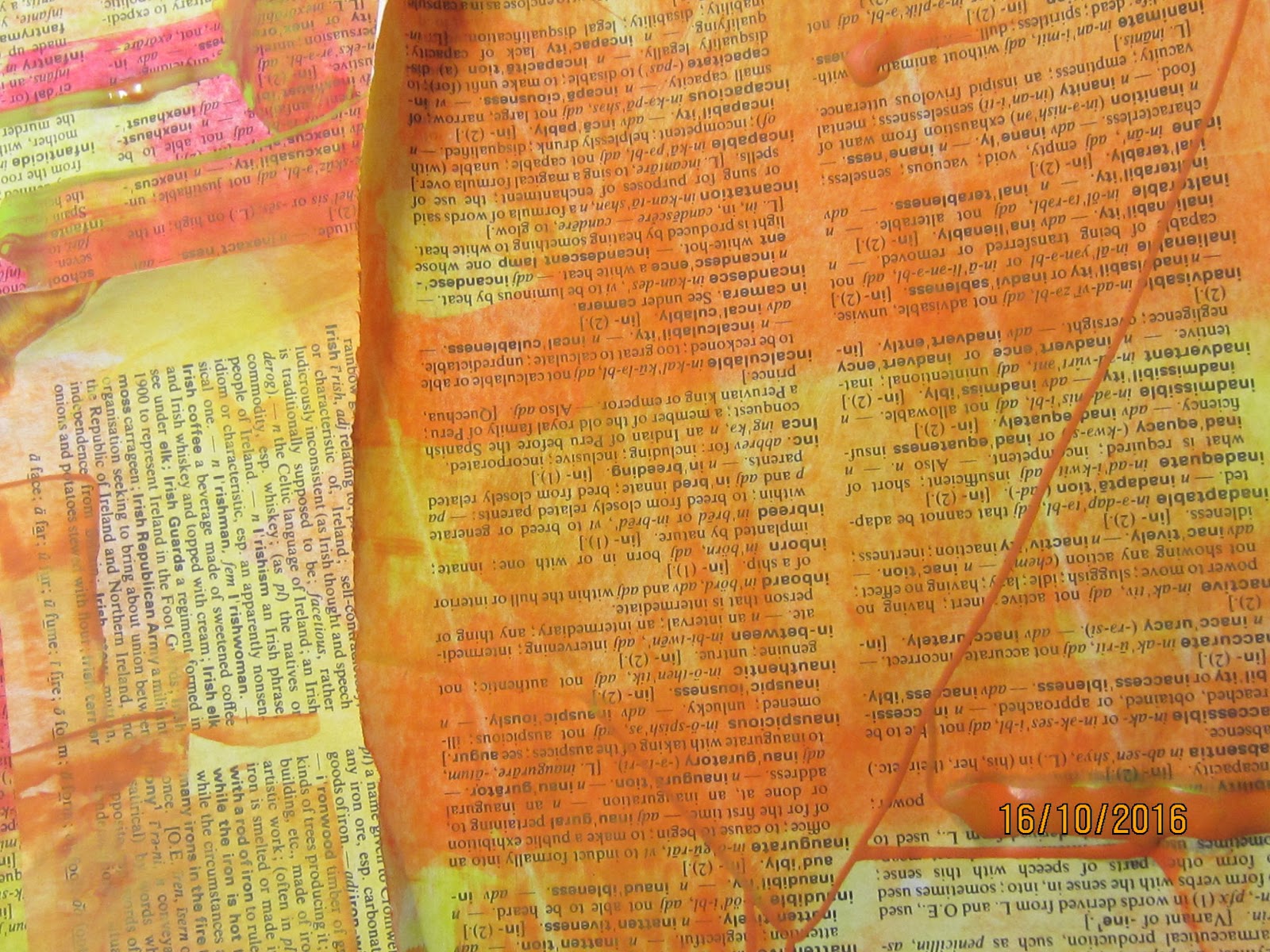
And finally a few pages with small amounts of paint and inks applied directly.


And last, but not least, inks applied directly to an old map.

All in all, a good day and mojo fired up.
And a good supply of pages for collage etc.
I will pop back and let you know what I think of the inks once they had dried.

Inky powders
19 August 2016
I love Brusho powders.
I love the way that they can be turned into ink, can colour other media but best of all the way that they can be used dry and then spritzed with water.
I am using them just now in the Transfusions project I am working on.
But you may also know that I love Paper Artsy paints.
And now, just to tempt me, Paper Artsy have introduced an Ink Powder range - Infusions.
Oh - the temptation!
And I have not yet succumbed (how strong willed is that?) but I did find this little video which I thought to share with you. Some really useful stuff here on how to use these powders.
I love the way that they can be turned into ink, can colour other media but best of all the way that they can be used dry and then spritzed with water.
I am using them just now in the Transfusions project I am working on.
But you may also know that I love Paper Artsy paints.
And now, just to tempt me, Paper Artsy have introduced an Ink Powder range - Infusions.
Oh - the temptation!
And I have not yet succumbed (how strong willed is that?) but I did find this little video which I thought to share with you. Some really useful stuff here on how to use these powders.
I the video link does not work from this post you can pop over to Youtube and find it here. The Blogger is Scrapcosy - I don't know anything about her. Sorry.
But let me know if you use these powders and how.
Meanwhile, I am wrestling with how to fix Brusho. I don't want to paint on a fixative - that will loose the random effect I get from using a spritz of water. I think I will have to find a fixative spray. Again, if anyone has any tips do leave me a comment.
Thanks, and hope you enjoy the video.

Paints
9 February 2016
If you pop by thus blog from time to time you might know I'm a bit of a fan of Fresco Finish paint by Paperartsy.

They have a lot of pigment and seem to go a long way. That said I tend not to use them for mono printing, instead I usually use a heavy body acrylic from Daler Rowney or similar ( I find for the effect I want the dark colours work best - navy, black, dark red/maroon, dark green - and often achieve the dark tone by mixing in a bit of black.)
The Fresco Finish paints come into their own for hand colouring and they can also be watered down and used in a spray bottle.
But they are brilliant for brayering onto backgrounds to build up layers of colour. And they dry really quickly making this a really speedy process.
What I love about these paints is that they have different opacity - layering the colours can have a wonderful effect - the translucent paints won't obliterate the paint underneath but instead will blend over it.


Paperartsy do little instruction videos - I have shared a few before - but they've just produced this one to show the new paint ranges for 2016.
If, like me, you are not so hot on colour theory you might find this very useful. What I love is the way the paints are grouped into families. It gives a real insight into cool and warmer colours etc.
I'm not going to explain it here - instead have a little look at this video.
By the way, I think I'm going to give their new retarder a go. You may recall mine was a mare to use last time. I think I should invest in some more and perhaps try a different brand - though I will ask them first if they think their retarder will work with a heavy body paint.
Anyway, I hope that like me, you find this video useful.

Russian Inspiration
10 August 2015
As you know, if the day job gets a bit much I can find it difficult to make time to create work (or even do sketch booking - though I do try!)
Then, if you pop by this little bit of bogland from time to time, I go off on little web wanders, read blogs etc.
And I found this on the Paperartsy blog.
Now this might not be your style, but it is the process that I found very interesting. It is based on Russian imagery. Worth having a look if you are a painter.
The whole of the base colour is gold, and then other colours are added on top but leaving some of the gold exposed. And because many Fresco paints are translucent the gold shows through.
I might give this a try in my sketch book.
(Note: if the link does not work try pasting this address into your browser
http://blog.paperartsy.co.uk/2015/08/2015-14-inspired-by-russia-by-liz-borer.html )
Subscribe to:
Posts (Atom)