
Do you ever look at a photograph and feel completely inspired by the colours?
And then do you walk down the paint aisles at major DIY retailers and either feel completely overwhelmed or disillusioned?
Yes - me too.
But a little while ago, I think it was on Julie Fei Fan Balzer's blog, I discovered that there are apps out there that help you analyse the colours in photographs.
So I had a little play.
First of all, I used https://palettegenerator.com/

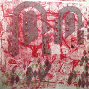
This first one was generated from an acrylic painting.
That feels about right, but I was surprised by the next one, generated from a photo I took in a flower shop in Malmo.

I thought there would be more pink and green - these are the colours that I 'see' when I look at the source photograph.
So I homed in on a smaller, brighter section of the photograph and tried a different palette generator. This one is https://www.canva.com/color-palette/


I did this twice, using two slightly different areas of the source photograph.
Again there is 'brick red' where I only see pink but I feel more trusting of the second site. The colours 'feel' better.
But I am still not getting pink. And to me, there is a pop of very definite pink in the photograph.
Have you ever used one of these websites and if you have, do you have a favourite? And I would be intrigued to know if anyone has taken a colour analysis like this to the next stage.
Thanks for stopping by and do let me know if you have experience of these colour analysis sites.


Now you've got me interested!
ReplyDeleteWell I know you love colour Sherie! Could be a great way to design a colour palette for a quilt.
DeleteI've tried three others. Some have more adjustments you can make that may bring out the colors one thinks should be on the chart but in all I have found these a little disappointing to work with. But you should give them a try:
ReplyDeletehttp://www.colorexplorer.com/
https://www.degraeve.com/color-palette/
http://www.cssdrive.com/imagepalette/
It's been a very long time since I played with these and no, I never took it to fruition as in using the info in my work. But I do remember having the same frustration as you have had. I have to wonder if we see the colors in the photo differently than what gets popped out in a chart because of the way the colors will interact as they are juxtapositioned in the photo. Here's my blog post: https://idahobeautyquilts.blogspot.com/2011/05/color-palettes.html
Oh - thanks Sheila. I will go and explore these. H xxx
Delete